
Same ingredients as everyone else — Swift, SwiftUI, Xcode, the WWDC sessions, the HIG. So why are so few apps actually great? Fresh from Apple Park, a look at Apple’s 8 design principles (WWDC26) and the full recipe: from the first screen all the way to the App Store.
The Recipe for a Great iOS App 🍳
You know the feeling. An app you open and that just works — not in the "it compiles" sense, but in the "it gets me" sense. Everything is where it should be, nothing creaks, and you walk away thinking "huh, that was nice." And you know the opposite: the laggy button, the janky scroll, the permission pop-up that lunges at your throat before you've even figured out what the thing does. Between the two lies a whole world. And what separates that world is almost never a magic ~~feature~~ capability. It's a recipe.
I’ve been publishing apps since the very early days of the App Store, back in 2008. I’ve released about 40 apps, with hundreds of millions of cumulative downloads, and I’ve attended about 15 WWDCs. And the question I’m asked most often hasn’t changed one bit: What makes an app great, rather than just functional? I’m writing this on the fly, still a bit dazed, from the other side of the world—I was at Apple Park for WWDC26, and upon my return, I co-presented a talk with Claire. The talk was called The Recipe to Build a Great iOS App. Here’s the long version—the complete recipe—the one we never have time to go through in full on stage.
Why a recipe?
Two people with the same eggs don't cook the same dish. It's that simple. In iOS dev, everyone has the same eggs: Swift, SwiftUI, Xcode, all free; hundreds of WWDC sessions in the open; step-by-step tutorials; and the Human Interface Guidelines, Apple's design bible, one click away. Nobody has a secret ingredient stashed in the fridge. What sets a great app apart is how you assemble all of it. And here's the good news: that can be learned.
Apple proves it every year. In 2026, out of more than two million apps, only 12 won an Apple Design Award — chosen from 36 finalists, across six categories. The bar is high. But look at who clears it: a two-person studio in the Netherlands next to a team that's been iterating for ten years, a solo developer in India next to CD Projekt Red. Apple's message is clear: design isn't about budget, team size, or audience. It's about care.
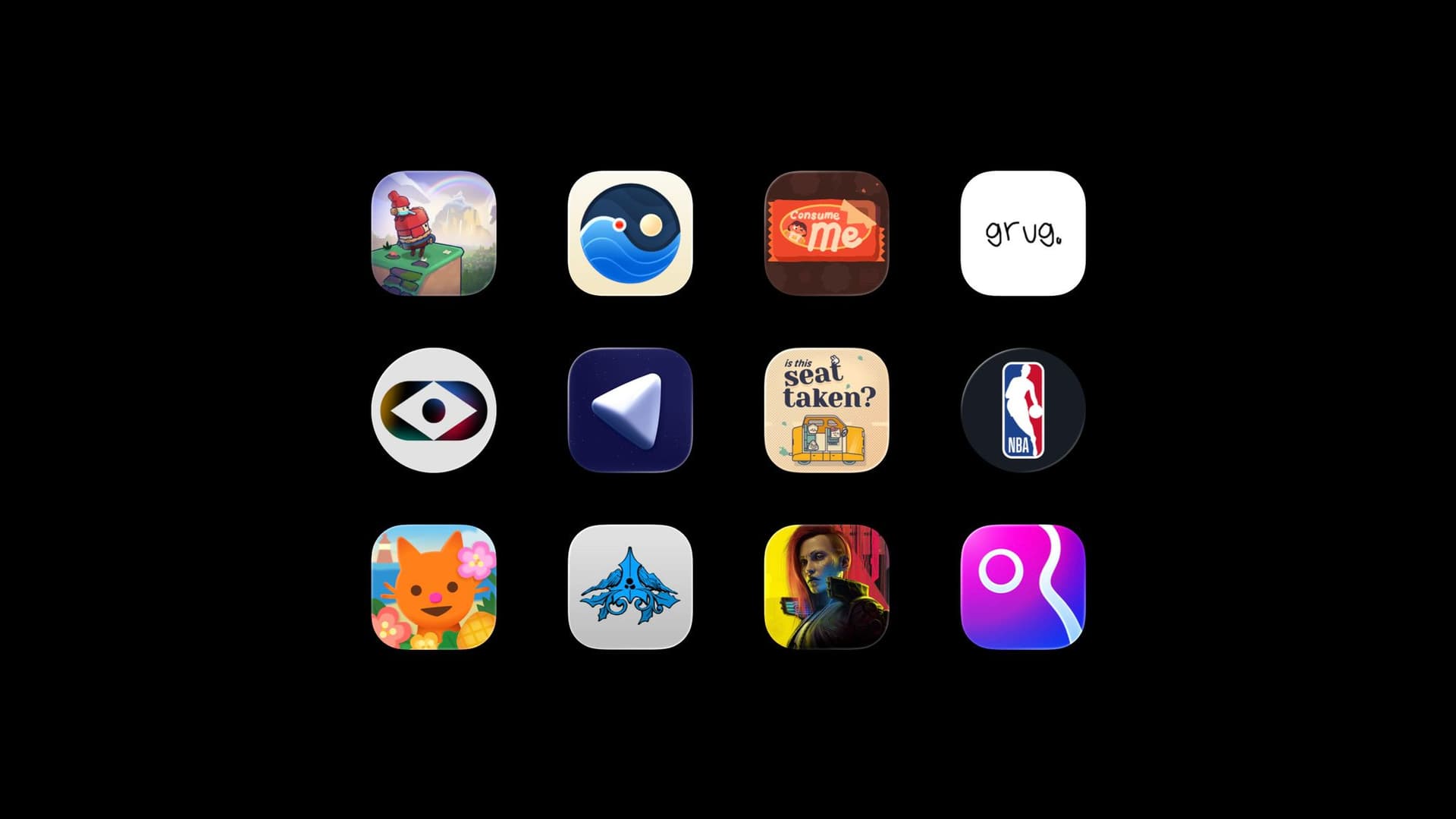
And the funny part is, you already use these apps. You just don't know why they work — yet. We'll meet a handful along the way — not to name-drop, but because each one embodies a precise point better than a paragraph could.
Design with intention — purpose before code
At WWDC26, Apple published a new foundational session, Principles of great design (session 250, seventeen minutes, watch it twice). It lays out eight principles: Purpose, Agency, Responsibility, Familiarity, Flexibility, Simplicity, Craft, Delight. And Apple hammers home something juniors hate to hear: there is no formula. "It's up to you to use your knowledge and intuition." Pushing one principle can compromise another. Making that call — that's the craft. These eight aren't a recipe to follow to the letter. They're your ingredients. The cooking is yours.
On stage, Claire took four of them and I took four. Here I'll give you all eight, in recipe order rather than slide order. And it all starts with the most thankless one, the one everybody skips: Purpose. The mise en place. In a kitchen, it's prepping everything before you light the stove. In design, it's asking yourself the only question that matters before a single line of code: does what I'm making have a real purpose? If it's not crisp, it's not ready.
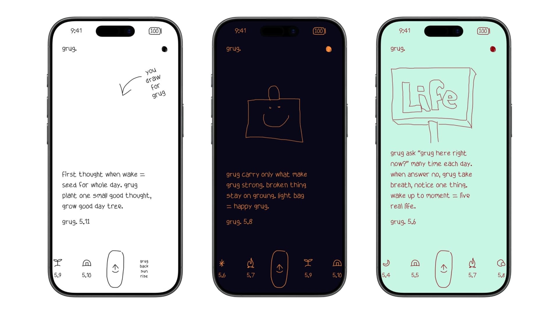
My first witness is grug — Apple Design Award 2026 (Delight & Fun), from the Dutch studio Ocho, two people, Jip van der Velde and Michel Elings, who've worked together since 2012. grug is one idea: a single affirmation a day, in Neolithic grunts. "only walking grug find breakthrough… sitting grug find nothing." No login, no cloud, no social. Its strength isn't what the two of them had the talent to add — it's everything they had the courage not to add. (They even built a hand-drawn font engine and a custom status bar; their Q&A on the Apple site is worth a read.) Omission counts as much as addition. Choosing what you make is deciding what you leave out.
So how do you find that purpose? You write it in one sentence: [what it does] for [who], in [which moment of their life]. If your sentence needs an "and," you might be holding two apps, not one. Then you list everything you could build, and cut anything that doesn't serve the sentence. Every feature that survives has to "pay rent": does it deserve the time, attention, and trust it demands? Because that's the real cost of a feature — not dev hours, but three scarce resources you're taking from your user. The junior trap is adding because you can ("eh, it's two hours of work"). Every addition dilutes the purpose. Defending the purpose means saying no — often. Ultimate test: show your sentence to three people. If they can't guess what the app does, your purpose isn't sharp enough. "Visual daily planner for neurodivergent brains." "Daily wisdom in Neolithic grunts, no account needed." If you can't do it, head back to the kitchen.
In control — and forgiven
The second principle, Agency, is letting people act their way. An interface should never get in the way of what someone's trying to do. Let them dive in, explore at their own pace, skip onboarding if they want, rearrange the interface as they see fit. You guide, you don't put people on rails. More control means more engagement — that's not a slogan, it's mechanics.
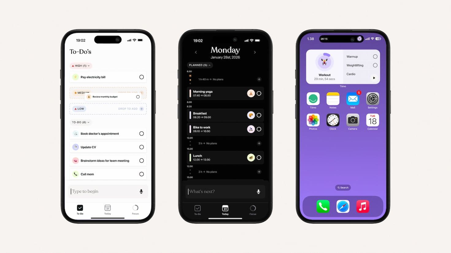
My witness here is Tiimo, named iPhone App of the Year at the 2025 App Store Awards (and already an Apple Design Award finalist in 2024). A visual planner that gives neurodivergent brains back control over their time. The team is in Copenhagen, the app is used by over a million people, and — a detail that isn't one — it's 100% ad-free, forever. Tiimo was designed with the people it serves, not just for them. That's what giving agency means: not deciding on people's behalf.
Agency's corollary is forgiveness. People send, edit, and delete by accident constantly. Your job is to make all of it reversible. Apple offers a clean hierarchy for handling risky actions, best to worst. Undo first, by default: everything reversible, the user dares then backs out. Confirm next, only when undoing is impossible (a permanent delete, an irreversible send). Interrupt as a last resort, to prevent real disaster. The classic beginner mistake is confirming everything: after enough "are you sure?" prompts, the user clicks "yes" without reading, and the warning protects nothing. In code, this comes down to three things you should know cold: an UndoManager, a confirmationDialog, and the .destructive role on your sensitive buttons. That safety net doesn't slow the user down — it gives them the confidence to explore your app. And therefore to adopt it.
In people's best interest — and responsible AI
The third principle, Responsibility, starts with privacy. Apple has a metaphor I love: picture a stranger walking up to you with "give me your phone number," no reason given. You wouldn't trust them for a second. And yet thousands of apps do exactly that — the permission pop-up fired at launch, before you've understood what the thing is for. A responsible interface waits for the right moment, asks only for what's strictly necessary, and explains why.

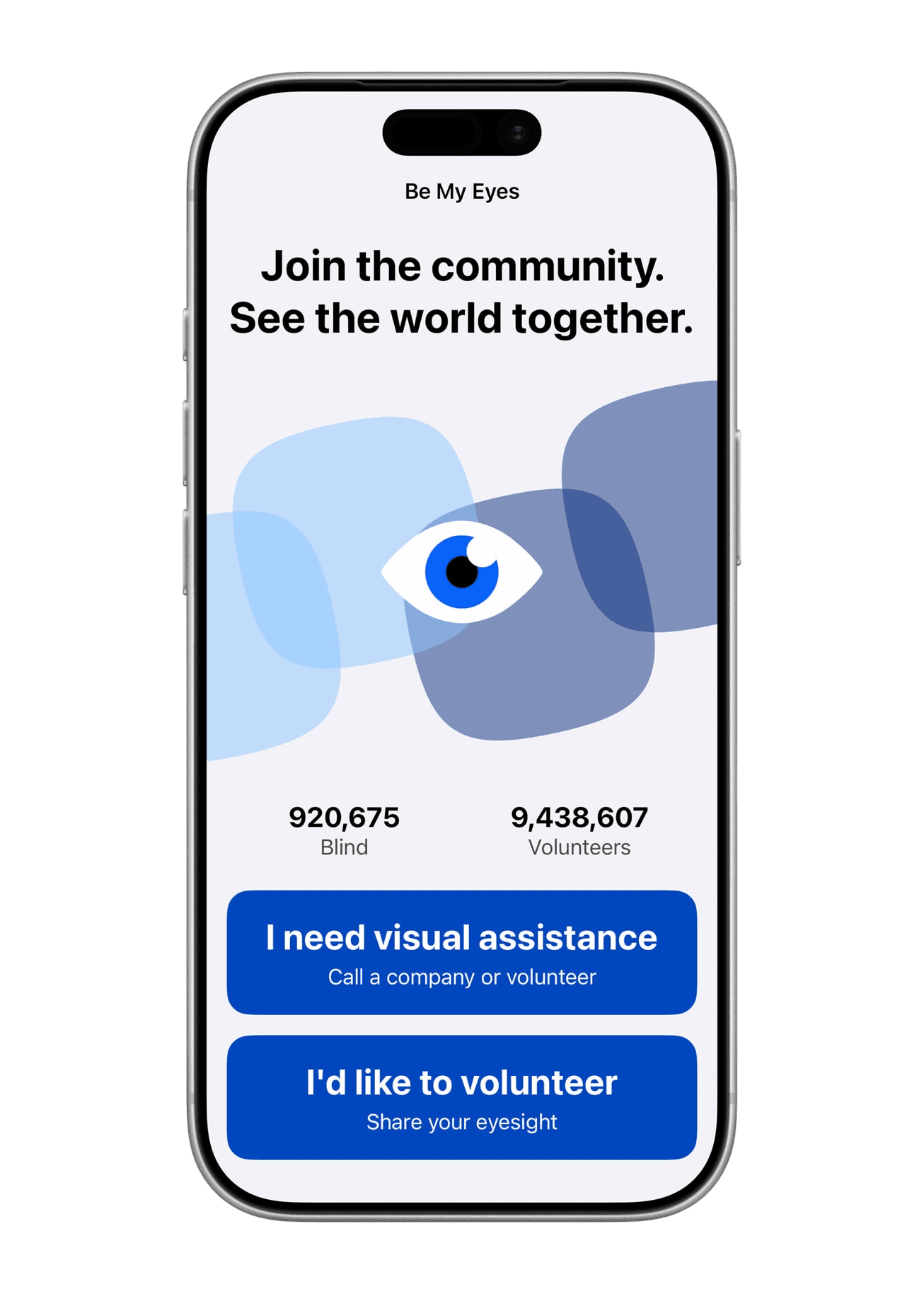
The perfect witness is Be My Eyes, a Cultural Impact winner at the 2025 App Store Awards. The app, launched in 2015 by Hans Jørgen Wiberg — who began losing his own sight at 25 — connects blind and low-vision people with sighted volunteers, and more recently with an AI, Be My AI. And here's the detail that changes everything: camera access fires only when the user asks for visual help, never at open. Be My AI was co-built with thousands of blind and low-vision testers. The AI complements the human; it doesn't replace them. That's the model.
And we have to talk about AI, because in 2026 it's everywhere. iOS 27 — announced at this WWDC, Tim Cook's last keynote as CEO — pushes Siri, Apple Intelligence, and on-device Foundation Models into every corner of the system. Those models run on the device, for free, without shipping your data off anywhere. It's a huge opportunity for us developers. But the more intelligence you add, the heavier the responsibility. Apple's example is deliberately mundane, and that's exactly why it lands: a recipe app. The user has declared an allergy. The model, left to its own devices, suggests a dish containing the allergen. That's not a cosmetic bug — it's a real danger. The lesson: a model can produce the unexpected, the wrong, the harmful. Anticipate the worst, then add guardrails (previews, confirmations, disclaimers) — or cut the feature entirely if the risk outweighs the value. Guardrails go in at design time, not as a patch after the rejection.
Speaking the platform's language — familiarity & flexibility
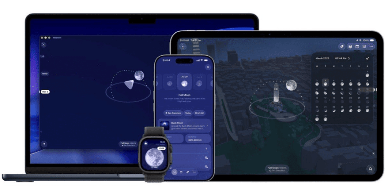
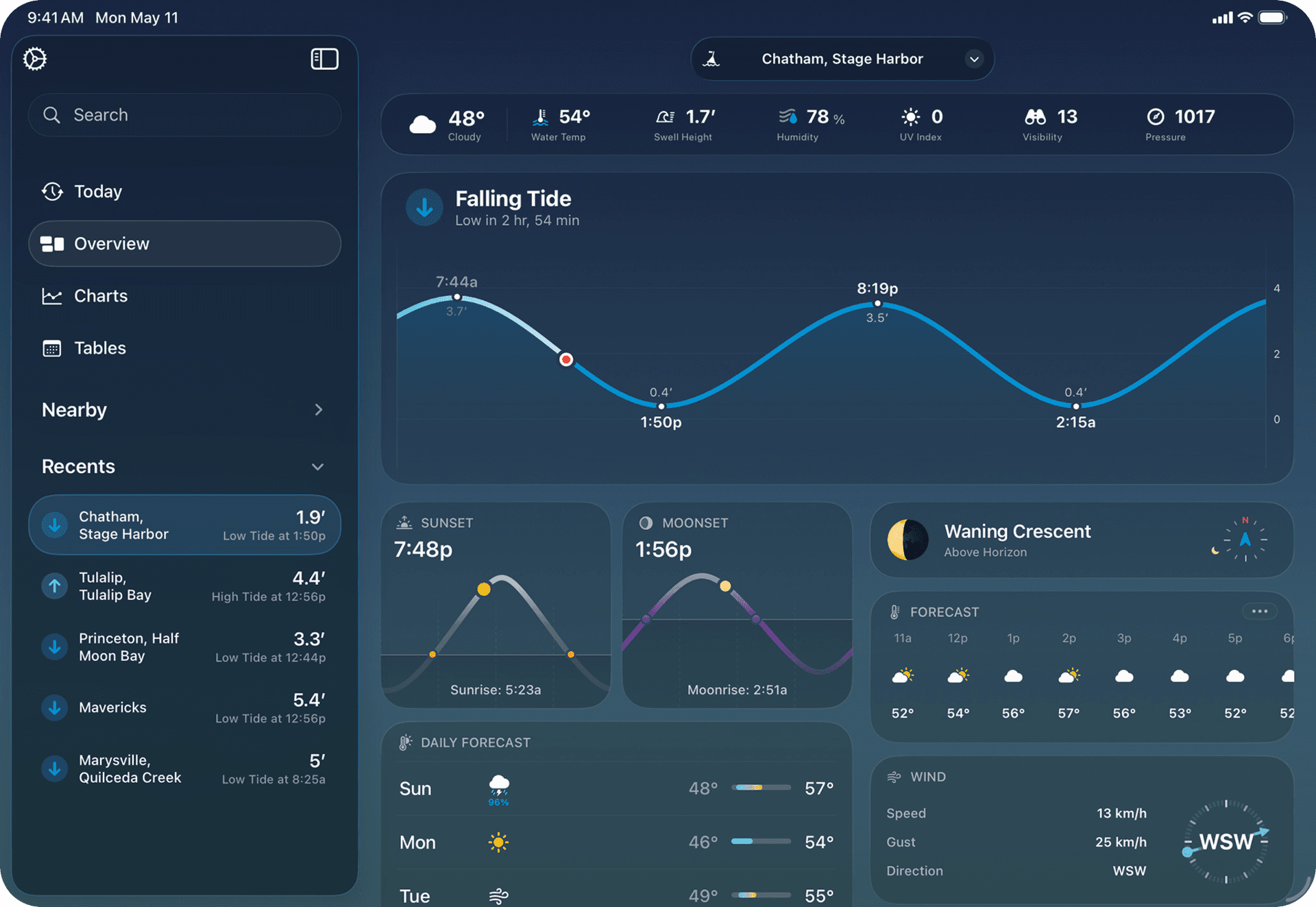
Fourth principle, Familiarity. Your audience shows up with a lifetime of experience: the real world, plus the conventions of every other app they use. Lean on it. The trash can = delete (and recover); repurpose that icon for something else and you shatter recognition instantly. Things that look alike should behave alike. On a Mac, you always close a window from the top left — the user shouldn't have to think. For common actions, don't reinvent the wheel: system components first. The 2026 face of that familiarity is Liquid Glass, the material introduced at WWDC25 and now everywhere in iOS 26. In code it boils down to .glassEffect(), GlassEffectContainer, .buttonStyle(.glass). One trap that'll cost you an evening: an ancestor with .clipped() or .mask() breaks the effect with no warning at all. Prefer system components before sprinkling custom glass everywhere. (Apple's official showcases this year are Moonlitt and Tide Guide, if you want to see it done right.)
Then there's Flexibility: people use your design in ways as unique as they are. Apple's example is music — at home on speakers, running with AirPods and a Watch, in the car hands-free: same app, three experiences. The most concrete way to embody flexibility in 2026 is to step outside your own screen. You expose your app's actions to the system through App Intents, and suddenly it lives in Siri, Spotlight, Shortcuts, widgets, Control Center, and Apple Intelligence — without anyone opening the app. That's discovery and retention at once. For a new app, pick one or two key actions ("add a task," "start a timer"), give them an App Intent, then wire them into Apple Intelligence via Assistant Schemas. An old-timer, John Geleynse, was already calling this "Connected" back in the iOS 5 era: your app should reach beyond its own window. The 2026 version of that idea is App Intents.
The right tools — Swift, SwiftUI, Xcode
We've got the intention, the purpose, the principles in mind. Time for the utensils. And here's the reassuring part: three are enough to start, all free. No React Native, no Flutter, no backend on day one. Swift first — a safe language (optionals and strict typing kill entire classes of bugs before the app even launches), approachable and fast. You don't have to master all of it; generics, actors, concurrency come later. Just enough to keep moving.
SwiftUI next: a declarative framework where you describe what the UI should do, not how to draw it. Less code, and one foundation for iPhone, iPad, Mac, Watch, and Vision Pro. The living proof is Moonlitt — Apple Design Award 2026 (Interaction), built by the Italian studio Flipping Hues (three developers who met at the Apple Developer Academy in Naples), entirely in SwiftUI. Moon phases, photo planning, onboarding in a few taps, and a Liquid Glass integration the judges called "best-in-class." A bit of 2025–26 magic: recompile against the iOS 26 SDK and an app picks up Liquid Glass automatically. No need to rewrite everything — but do run a visual audit anyway, because "automatic" doesn't mean "perfect."
The third tool is Xcode, the full workshop: editor, simulator, debugger, tests, distribution. The SwiftUI + Previews combo is a game-changer when you're starting out: you see the effect of every line immediately, no full rebuild. Drop a #Preview on every non-trivial view until it becomes a reflex. And above all: you don't learn to cook by reading recipes. Apple offers free guided paths — do Scrumdinger end to end, the sample app that covers lists, navigation, persistence, and accessibility. You'll learn more from one finished app than from a hundred videos watched at 2×.
The base — architecture & data
A dish with no structure collapses. Before you think about craft, lay solid foundations. An app is three things in conversation: the views, the data (the truth), and navigation. Getting them right early saves you from rewriting everything three months later. The beginner trap is data that contradicts itself from one screen to the next. The SwiftUI rule: one source of truth (@State, @Observable, @Bindable), with bindings that keep everything else in sync. To persist between launches, SwiftData is plenty for a v1 — same spirit as SwiftUI, more power and less code than Core Data.
And then there's the disease I see everywhere: you read ten architecture acronyms (MVVM, TCA, VIPER… ~~and other anxiety-inducing incantations~~) and you freeze before writing a single view. Stop. Stay simple, follow the grain of the platform, and refactor only when the pain shows up. Remember: grug is two guys with no architecture blog. Tiimo is ten years of iteration before the App of the Year title. An imperfect app that exists will always beat a perfect architecture that's never finished.
The seasoning — what separates good from great
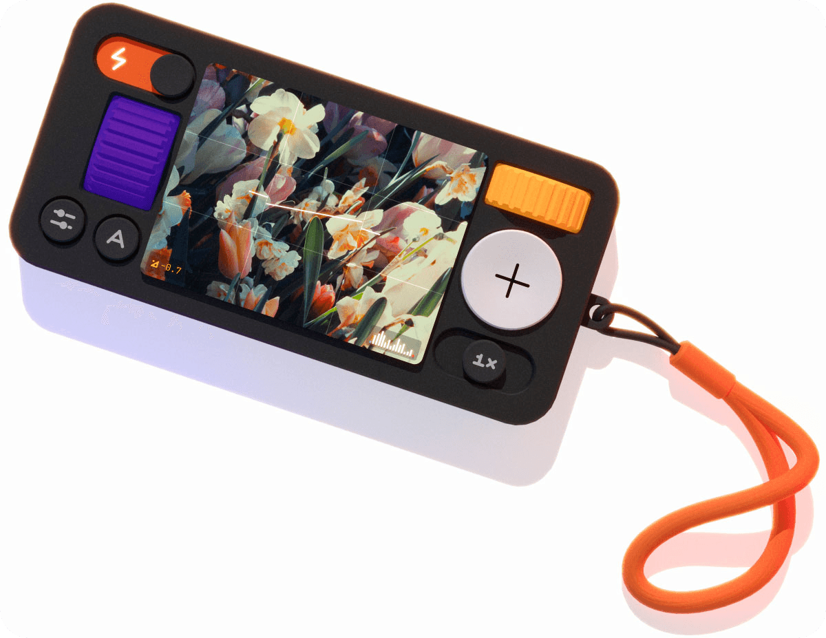
The dish is cooked. Time for the details — invisible on their own, but you feel them all together. This is Craft: "the attention to detail that tells people you really care about their experience." You can sense a sloppy product — a wobbly door, a shirt coming apart at the seams. A laggy button, a janky scroll, misaligned icons, a layout that breaks on rotation — it feels fragile, and you start doubting the quality of everything else. Craft, conversely, inspires confidence. Its "materials" are crisp type on every screen, colors that adapt to light and dark, responsive animations that answer your finger, all on reliable SDKs. My witness here is (Not Boring) Camera, a 2026 ADA finalist (Visuals & Graphics): the studio's signature is its obsession with materials — a 3D interface, dynamic lighting, haptics and sound so realistic you'd swear you're holding a film camera.
Craft's cousin is Simplicity — and watch the misconception: simple ≠ minimal. Burying everything in one place is minimal, not simple. Simple means frictionless, intuitive — you find what you're looking for without effort. It comes from being concise (plain language, fewer steps) and clear (a strong hierarchy: order, spacing, contrast, so the most important thing is the most obvious). Sometimes simplifying even means adding context in the right spot — the time remaining shown on a play/pause button. The perfect witness is Tide Guide, an Apple Design Award 2026 winner (Visuals & Graphics) from the U.S. studio Condor Digital. The subject is utterly mundane — tides — but the execution is exceptional: complex hour-by-hour data distilled into a single chart you read at a glance, with a palette that matches the color of the sky through the day. Mundane subject, obsessive care. That's the whole point.
Seasoning also means accessibility — and let me be blunt: it isn't a luxury, it's more users and a better app for everyone. VoiceOver, Dynamic Type, sufficient contrast, touch targets of at least 44×44 points. Be My Eyes and Tiimo made it a pillar from the start; on the TV side, HBO Max even earned a 2025 Apple TV App of the Year title after adding American Sign Language. And since iOS 26 there are Accessibility Nutrition Labels on the App Store page: nine declarable features (VoiceOver, Voice Control, Larger Text, Dark Interface, Differentiate Without Color, Sufficient Contrast, Reduced Motion, Captions, Audio Descriptions). It's voluntary today, but it'll become mandatory — so get ahead. One golden rule: be honest. Every common task in the app must be doable with each feature you declare. Otherwise, don't declare it. (The WWDC25 session "Evaluate your app for Accessibility Nutrition Labels" walks you through the method.)
And since we're on craft, let's talk performance, because in June 2026 Apple's signal is unambiguous. iOS 27 is what the press immediately dubbed a "Snow Leopard" release — a nod to the famous Zero New Features of 2009. No fireworks, but Apple published a list of more than forty very real optimizations: app launches up to 30% faster, photos appearing 70% faster after capture, AirDrop 80% faster, and a rewritten CPU scheduler that benefits the whole fleet, all the way down to the iPhone 11. The translation for you is brutal: an app that feels slow will be punished even harder, by contrast. Smooth animations, fast launch, zero scroll freeze — and test on real devices, ideally an iPhone 11 or 12, not just the simulator of the latest model. Craft, finally, means longevity: when new features or new hardware land, evolve with them, and people feel supported. "Design is never really finished" — that's not a ~~Pinterest~~ quote, it's the reality of every App of the Year.
Plating & service — test & ship
You don't serve a great dish on a dirty plate. Before the App Store, there's TestFlight: up to 100 internal testers (your App Store Connect team members) and 10,000 external testers via a public link or email. The first external build goes through a Beta App Review — a queue separate from the App Store's, often a few hours, sometimes longer. Feedback, screenshots, and crashes flow straight into App Store Connect. And I'll say it again because nobody does it: test on real devices. The simulator reproduces neither performance, nor battery, nor real permissions.
The second thing people underrate: the App Store page is part of the app. Icon, screenshots, description, Privacy Nutrition Label, Accessibility Nutrition Label — all of it must honestly reflect what the app does. Apple is explicit about this: misleading metadata is a guaranteed rejection (Guideline 2.3). Screenshots have to show the real app, not fake UI or a "coming soon." And while you're at it, read the App Review Guidelines early, not as a wall at the end: five sections (Safety, Performance, Business, Design, Legal). If you ever add in-app purchases, read the Business section before you code, not after. In 2026, Apple says about 90% of submissions are reviewed within 24 hours — but that's mostly true for updates to established apps. A first submission often takes 2 to 5 days (longer in September and December, longer in regulated categories: health, finance, kids). And treat every rejection as a precise technical requirement, never as a verdict: paste the rejection text into your notes and fix it point by point.
Going live means the Apple Developer Program, $99/year: TestFlight, App Store Connect, certificates, push notifications, Sign in with Apple — all included. (And to code on your own iPhone, you don't even need to pay: the free developer account is enough, with a renewable 7-day certificate. The paid program is only required for external TestFlight and publishing.) You archive in Xcode, upload, submit in App Store Connect, and you can even enable a phased release that rolls out gradually over seven days. And just like that, your dish lands on 175 storefronts worldwide. Think about localization early — at minimum the description and screenshots for your target markets.
Bring in the customers — and keep the dish alive
You've served a great dish. But a restaurant nobody can find isn't a great restaurant. The App Store sees hundreds of millions of visitors every week — and visibility is earned. Discovery is ASO plus marketing, and every element of your page weighs on downloads. On the search-indexed side, you get 30 characters of title, 30 of subtitle, and a 100-character keyword field: 160 characters of SEO surface, to choose with a scalpel. The name and icon make the first impression; the first line of the description is the most-read (but it's not indexed — the keywords in the dedicated field are). Pick your category carefully, and don't stuff keywords into the title, on pain of rejection (2.3 again).
Three levers many people ignore. Custom Product Pages: up to 70 versions of your page, each with its own screenshots, promo text, and a unique URL (?ppid=…) to drop into your campaigns — a "parents" page, a "pro" page, a seasonal page, each measured separately, and since iOS 18 they can deep-link to the right screen. Product Page Optimization: a native A/B test in App Store Connect that shows variants of your icon, screenshots, or app preview to a random sample and names a winner at 90% confidence (measure over at least two weeks). And the trio of campaign links (to attribute your channels in App Analytics), Apple Ads (Today tab and search-results placement, a modest budget is enough to test keywords), and Featuring Nominations (a form in App Store Connect to pitch Apple's editorial team — tell the human story: Be My Eyes and Tiimo are the models). Start with one or two Custom Product Pages aligned with your biggest channels; the cap of 70 isn't a target.
And once you're live, the real work begins. An app is never "done." You listen to feedback (TestFlight, App Store reviews, support email), you read crashes in the Xcode Organizer, you ship regular updates. You measure everything in App Analytics: page-to-download conversion, D1/D7/D30 retention, sessions, and the performance of each Custom Product Page. You respond to reviews — especially the negative ones, especially the early ones: the reviewer is notified and can raise their rating. Tiimo took ten years before its title. Be My Eyes has iterated since 2015. grug is two guys who've iterated since 2012. None of these apps shipped perfect. They iterated.
The secret ingredient
You were waiting for a secret ingredient, right? There's always one. And this one isn't a framework, an API, or a WWDC session. It's care. The intention at every step, from the first screen to the moment you dare ask for payment. It's really Craft and Delight combined — and Delight, that eighth principle that's hard to define but instantly recognizable, is never confetti tacked on at the end. It's the sum of all the consideration poured into the product: the natural result of doing every other principle well. Identify the emotion you want people to feel (relaxed, confident, excited), then reinforce it everywhere. That's what turns "it works" into "I love it."
My four witnesses — grug, Be My Eyes, Tiimo, Moonlitt — don't share a single function. A prehistoric affirmation, a visual aid, a planner, a moon-phase app. But all of them have people who truly cared. The only thing that matters, in the end, is how well your app meets the needs of the humans you're making it for. The rest is technique. And technique can be learned.
So the best advice I can give you fits in two words: come cook. Open Xcode today, grab an Apple tutorial, make a small app — even a silly one, even an ugly one. An app described in one sentence, a TestFlight beta sent to three friends, an honest App Store page. Close the full loop once; aim for that, not for perfection. It's what we keep telling each other at every ⌘+F community meetup, and it's the difference between the people who are "about to get started" and the people who ship.
And if you've got an exceptional project, reach out. Innovating is what makes me tick.
Going further
On the design side, keep the Human Interface Guidelines close (free, living, expanded with a new Design principles page at WWDC26) and the Principles of great design session. On the code side, Swift, SwiftUI, App Intents, and the Apple tutorials. On distribution, TestFlight, the App Review Guidelines, and Custom Product Pages. And for inspiration, nothing beats the Apple Design Awards and App Store Awards 2025 pages — plus the store listings of the apps cited here, where juniors get to see the work up close. Thanks to Claire for half of this recipe. Now go cook. 🍳